
Morgan Stanley's Online Planning Experience: Expense Categories

Clear and intuitive categories, smarter and effective planning.
Morgan Stanley’s Online Planning Experience: Categories for Expenses
Many Americans have a retirement goal, but with the financial landscape in the U.S. becoming increasingly complex, retirement planning has become more critical than ever before. Even with greater access to 401(k)-style plans, many people still aren’t fully prepared. In fact, according to the National Council on Aging, 80% of older adults are either struggling financially or at risk of economic insecurity in retirement.
That’s where having a financial advisor can make a difference—helping individuals build a plan that navigates the challenges of retirement planning. Morgan Stanley goes a step further with a responsive web tool called OPE (Online Planning Experience), which makes it easy for clients to provide retirement goal details.
PROJECT ROLE
• Lead UX Designer
• Design Researcher
TOOLS I USED
• Figma
• Usertesting.com
• Optimalworkshop.com
Skills I Used:
• Auditing
• Card Sorting
• Card Sorting Analysis
• Tree/Treejack Test
• User Research
• UI Design
To view this project as a presentation, click here.
Overview
The tool helps users outline their retirement spending plans, savings accounts, and expected income sources. However, when the tool asks for pre- and post-retirement expense details, the categorization of the expenses appeared confusing and misleading.
In this 6-month project (combined with other projects for the same release), I was the lead designer and researcher, collaborating with business, engineering, financial advisors, design language, UX, research, accessibility, and stakeholders to drive the restructuring of the expense categorization experience, from research to release.
Project Goal
Since OPE sends the user’s details to GPS (Goals Planning System) – an internal tool used by the financial advisors, the information needs to be accurate so that the financial advisors can build the right strategy to help clients meet their retirement goals. Not only does the accuracy help financial advisors and our users with the planning, but it helps business teams keep accurate account of how expenses are being categorized across plans.
In this project, we want to identify what is the ideal experience, so that clients can intuitively find and navigate to the right destination when adding details of each type of expense. We want to ensure that the FA (financial advisor) and client can collaborate smoothly, avoid miscommunications, eliminate confusion, and have the same understanding around expense categories across both parties. Also, we want to maintain consistency in data between OPE and GPS.
The Process
While this project was heavily focused on information architecture and user research, the process was still similar to many of my other UX projects. I dove into the project gathering all the information I can to understand the problem, challenges, technical constraints, the goals and needs of everyone involved in the experience, explored a range of solutions that address the pain points, tested the solutions, then bringing the solutions into production.

Design process
Job Story
To help think about the context and user’s motivation, let’s use this job story as a starting point:
When I am adding a new expense, I want to be able to quickly find and navigate to the correct category when documenting each expense, so that I can provide the most accurate information to my financial advisor.
Understand: Discovery and Analysis
When designing the screens for OPE, we are generally required to align the experience with GPS, so that financial advisors can easily decipher the data and create the right financial plan for clients. However, sometimes what is intuitive to financial advisors, might not always be intuitive to our users.
For context, in the OPE experience, the user arrives at the list of categories through a couple different paths from the dashboard. They can either go through Retirement Spending, or Other Expenses section.
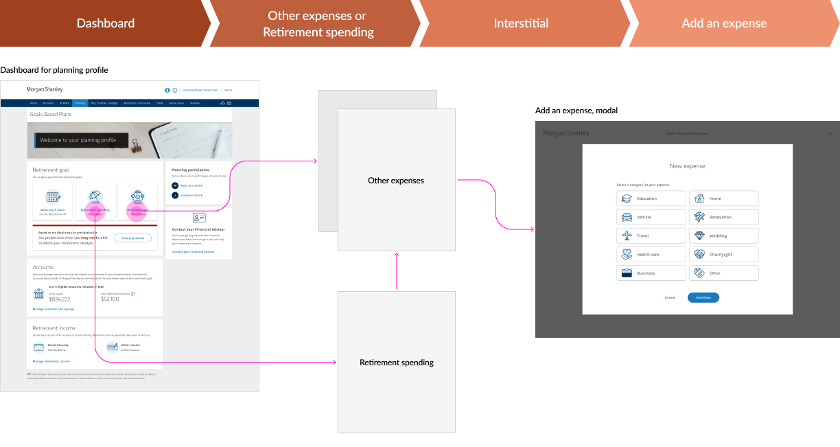
Navigating to the expense categories in OPE
At the start of this project, OPE used these categories:
• Education
• Vehicle
• Travel
• Health care
• Business
• Home
• Renovation
• Wedding
• Charity/Gift
• Other

OPE Expenses, before
In comparison, GPS used these categories:
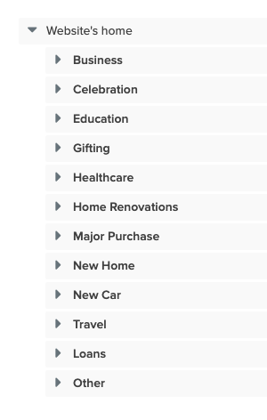
• Healthcare
• New Home
• Home Renovation
• Celebration
• Business
• Loans
• Education
• New Car
• Travel
• Gifting
• Major Purchase
• Other
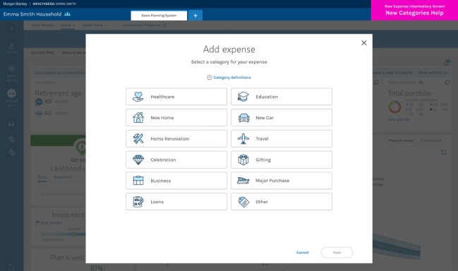
GPS, an Internal tool used by financial advisors
Both experiences contain areas of confusion and poses a number of questions.
In regards to GPS’s version:
• If bought a used car, would I enter it into “New Car”, because it’s a new car for myself, or is it a “Major Purchase”?
• How new does the car need to be, in order to be categorized as “New Car”?
• If I’m renovating a new home, would I enter it into “New Home” or “Home Renovation”? Is there a difference, and how would it affect the planning outcome?
• If the Other Expenses section is not for day-to-day expenses, why is Credit Card supposed to be included here?
• Could mortgage be categorized under “New Home”, instead of “Loans”?
• Why was “New Home” and “Home Renovation” broken out into separate categories?
• Is Other Expenses section for capturing all expenses, before and during retirement, or is it just during retirement?
As for the OPE version:
• What order are these categories following? Why does OPE start with Education?
• How is this screen supposed to be read? From top to bottom, left to right? Or left to right, top to bottom?
• Where would loans be entered into?
• Why was “Celebration” renamed to “Weddings”, when it includes celebratory events like retirement, milestone anniversary, or birthdays?
• If I’m renovating a home, would I enter it into “Renovation” or “Home”?
• Why was the help drawer removed? (The help drawer contained supplemental information around the category definitions)
To get a better understanding behind how expenses were being recorded on the receiving end, and identify any constraints we had, we spoke with the financial advisor team that uses the GPS tool. Currently, the GPS uses these categories and definitions:
Business – Major business expenses such as startup costs, business investments or taxes incurred due to selling a business. Ongoing business expenses due to normal day-to-day activities of a business would not be typically included in this expense category.
Celebration – Expenses associated with celebrations such as weddings, retirement, a milestone anniversary, or birthday.
Education – Education gifts for children, grandchildren, or others. Contribution to 529 plans and savings to other education savings accounts would not be typically included in this expense category.
Gifting – Gifts or donations towards charity or individuals.
Healthcare – Medical premiums or out-of-pocket healthcare expenses that would be funded out of your retirement savings or retirement income streams.
Home Renovation – Home renovation expenses such as those associated with remodeling some or a part of the house. Normal ongoing costs associated with maintaining a home such as property taxes, mortgage payments or home insurance would not be typically included in this expense category.
Major Purchase – Includes expenses associated with major purchases of items such as a boat, farm, yacht, plane, or land.
New Home – Upfront costs associated with a new home, such as downpayment and closing costs that are funded by retirement savings or retirement income streams. Normal ongoing costs associated with owning a home such as mortgage payments, home insurance, and property taxes would not be typically included in this expense category.
New Car – Upfront costs associated with purchasing a new car such as loan payments, car insurance, maintenance, gasoline, lease payments and taxes.
Travel – Includes expenses for holiday travel and/or vacation destinations. Expenses in this expense category would not typically include daily travel and/or commuting costs.
Loans – Repayment of loans such as personal loans, student loans, car loans, HELOC, LAL, credit card, mortgages funded by retirement savings or retirement income streams.
Other – Additional miscellaneous expenses that are outside your client’s normal retirement spending that would be funded out of retirement savings or retirement income streams.
The challenges
Based on discussion with the financial advisor team, we’ve identified a couple more challenges or constraints:
All user-generated data from the OPE side will be sent to GPS, which is handled by a separate team.
The current taxonomy and nomenclature used in the GPS system is what FAs are comfortable with and makes the most sense to them. Regardless of the research findings we receive around the user’s mental model, we won’t be able to change what is currently in GPS. Even if we were able to change what is in GPS, the technical effort would be too large to be considered.
So, how might we restructure the IA of the categories so that it is intuitive for users, and scalable in a way that doesn’t increase too much scope, but also map the data to a completely different system that might not match the user’s mental model, while adhering to the design language used throughout the cross-platform product, and meet accessibility guidelines?
Card Sort Study
To see how users performed with GPS’s structure, I proposed conducting an unmoderated, hybrid card sort study using Optimal Workshop, and gather additional qualitative feedback through UserTesting. While our team hasn’t used Optimal Workshop before, my experience with it in past research projects has shown that its analysis features are more robust than those offered by UserTesting.
To move forward, I connected with multiple team members to identify the right contact at Optimal Workshop, ensuring I could secure a temporary account while adhering to our firm’s security protocols.
Research Goals
The goal of this research study is to understand if Morgan Stanley look-alike users can navigate the experience of documenting their different types of expenses. To determine this, the study should:
• Identify any confusing taxonomy or nomenclature
• Identify groupings and naming conventions that users understand more easily

Research Methodology
Hybrid, unmoderated card sort
In this card sort study, users were given a set of cards and categories, however, users were given the option to rename or create new categories if they desire. We tested 8 “look-alike” participants from UserTesting, which match our target users.
8 “look-alikes” from UserTesting
These participants:
• Should have a dedicated or virtual financial advisor
• Should be planning with a partner
• Have $200K – $5M in investable assets
What was tested
Based on the category names and the definitions provided by GPS, I worked with the content strategist to produce the copy used for the card sorting test on Optimal Workshop. A few extra cards were added to provide more context, and also for research purposes to learn more about the users and their mental models.

Key takeaways
1. According to the research findings from the card sort study, we found that users bucketed these content pieces into a wide array of categories which did not match the GPS categories:
• Educational gift
• Donation towards an individual tuition
• Credit cards
• Student loans
• Mortgage
• Line of credit
• Wedding
• Car loans
• Birthday
• Taxes incurred from selling a business
• Purchase of land
• HELOC (Home Equity Line of Credit)
“Educational Gift was hard - since it could go either education or gifting.”
2. Users wanted more context for each category and content piece. With more context, users would have a stronger idea on where to sort the following cards:
• Wedding
• Mortgage
• Credit Card
• Purchase of Land
• Antique Car*
* Some cards, not originally part of GPS’s list of example expenses, were added to provide more context, and also for user research purposes to learn more about their mental models
“Credit card is a day-to-day expense. Where would I put that?”
“Would that be new home? Or Major Purchase?”
3. Based on written responses or verbal feedback, users felt that some of the categories could be consolidated more, especially around home and auto. Users agreed with keeping all loan-related content pieces under Loans.
4. Users had some confusion around the category names. Some are too similar in meaning to each other (Gifting vs. Celebration; Home Renovation vs. New Home) and some do not match the user’s mental model altogether (Travel, Celebration). Other categories were too granular (New Home, New Car).
5. The content under the “Other” category had the lowest agreement among users. The results were vastly different from one user to another.
Recommendations based on card sort findings
• Use polyhierarchical structure (Mortgage, educational gift, donations towards an individual’s tuition, credit card, student loans/loans, HELOC, Line of Credit)

• Consolidated the categories
• Home (Home Renovations, Closing costs to buy a house, down payment for a house, Mortgage)
• Auto (Down payment for a car, Car Loan, Antique Car)
• New Car as subcategory under Major Purchase, or combining into 1 category
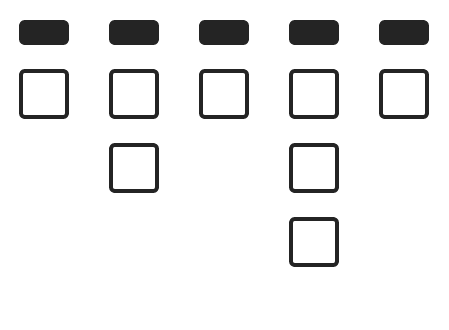
• Create new category names, for some (Gifting vs. Celebration; Home Renovation vs. New Home; New Home and New Car - were confusing)

• Provide more context
Examples:
Business – Startup costs, investments, taxes due to a sale
Major Purchase/Other Expenses – Boat, land, or something else
→ To view the full card sort study with detailed insights, please click here.
Explore: Ideate, Design and Test, Analyze
Tree/Treejack Test
Now that we’ve gathered sufficient amount of insights and learnings from the card sort study, we are ready for the next part of testing – the tree test.
Research Goals
In this research project, I conducted a tree test with 3 versions – GPS’s version for benchmarking purposes, and 2 proposed structures. This tree test will evaluate the proposed structures, and determine which one should be implemented. If there are areas that still need revision, this tree test will also provide insights on how to improve those areas as well.
At the end of this project, the goal is still to ensure that the client can intuitively find and navigate to the right destination when adding details of each type of expense. The FA and client should also have a shared understanding around the expense categories and be able to collaborate smoothly, without confusion or miscommunications.

Research Methodology
Tree test, unmoderated
Users completed a tree test through Optimalworkshop.com and provided additional feedback through Usertesting.com. Users were given tasks and asked to find the item within the provided information architecture structure.
75 “look-alikes” from UserTesting
These participants:
• Should have a dedicated or virtual financial advisor
• Should be planning with a partner
• Have $200K – $5M in investable assets
What was tested
Taking what we learned from the card sort study and using the recommendations as guideline, I collaborated with the content strategist to explore new structures that address the pain points found in the previous test. We concluded with 2 potential structures that could improve the experience.
GPS’s list
Test A (Proposed)

• Polyhierarchical items in the structure (ie., Student loans is under Loans and Education, Mortgage is under Loans and Home)
• Home and Car also appears under Major Purchases
• Gifting was renamed to Charity & Gifts, and also includes different types of gifts
• Sorted by popularity
Test B (Proposed)

• Polyhierarchical items in the structure (ie., Student loans is under Loans and Education, Mortgage is under Loans and Home)
• Other was renamed to Other Major Purchases/Expenses, and does not include Home or Car
• Gifting was renamed to Charity & Gifts, and also includes different types of gifts
• Sorted by popularity
How the tree test was conducted
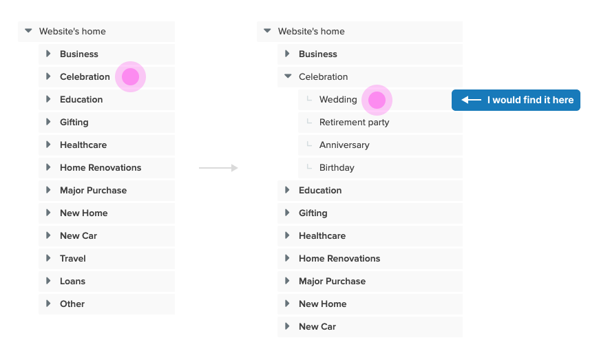
Users were given specific tasks, and then asked to find the location of the item within the structure. This essentially evaluates how well your information architecture performs in a real-world scenario.
Example task:
Someone in your family is having a wedding in the future, and you are paying all costs related to this event. Where would you enter this expense?
Key takeaways
1. Test A and B both consistently outperformed the original structure
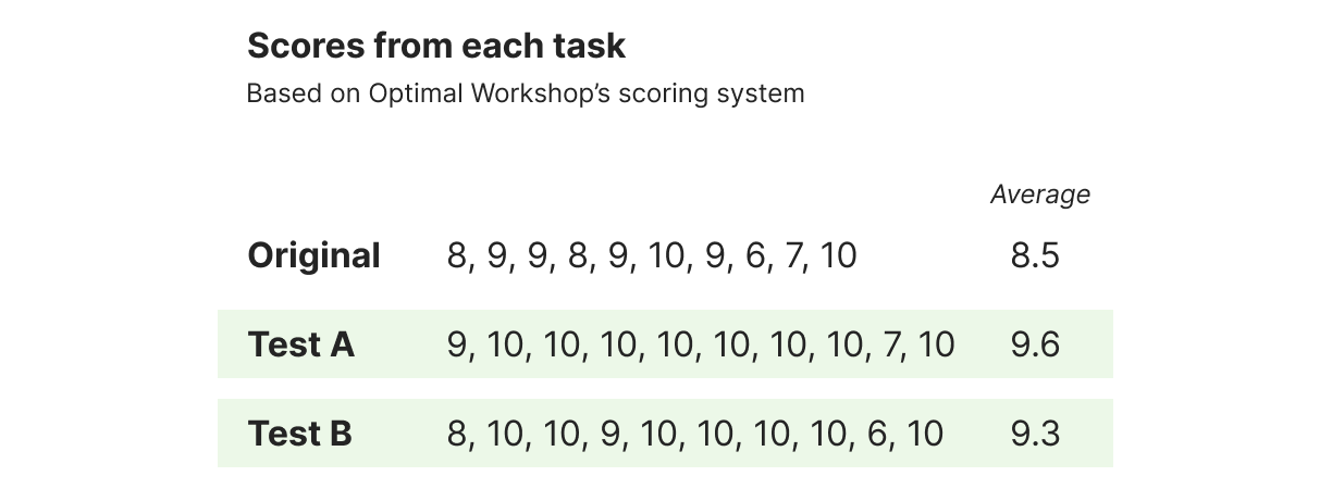
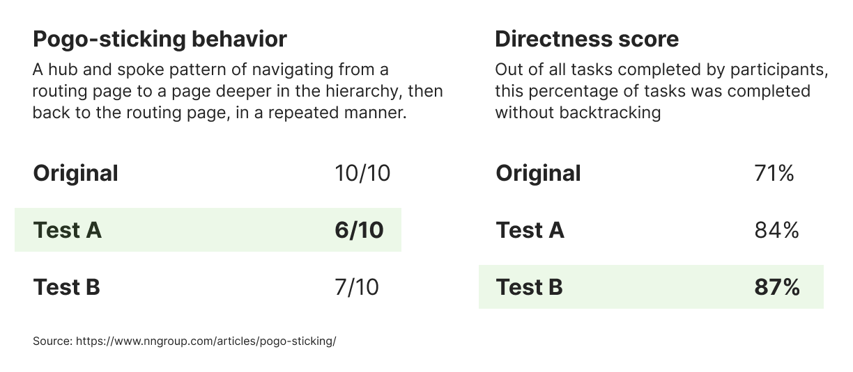
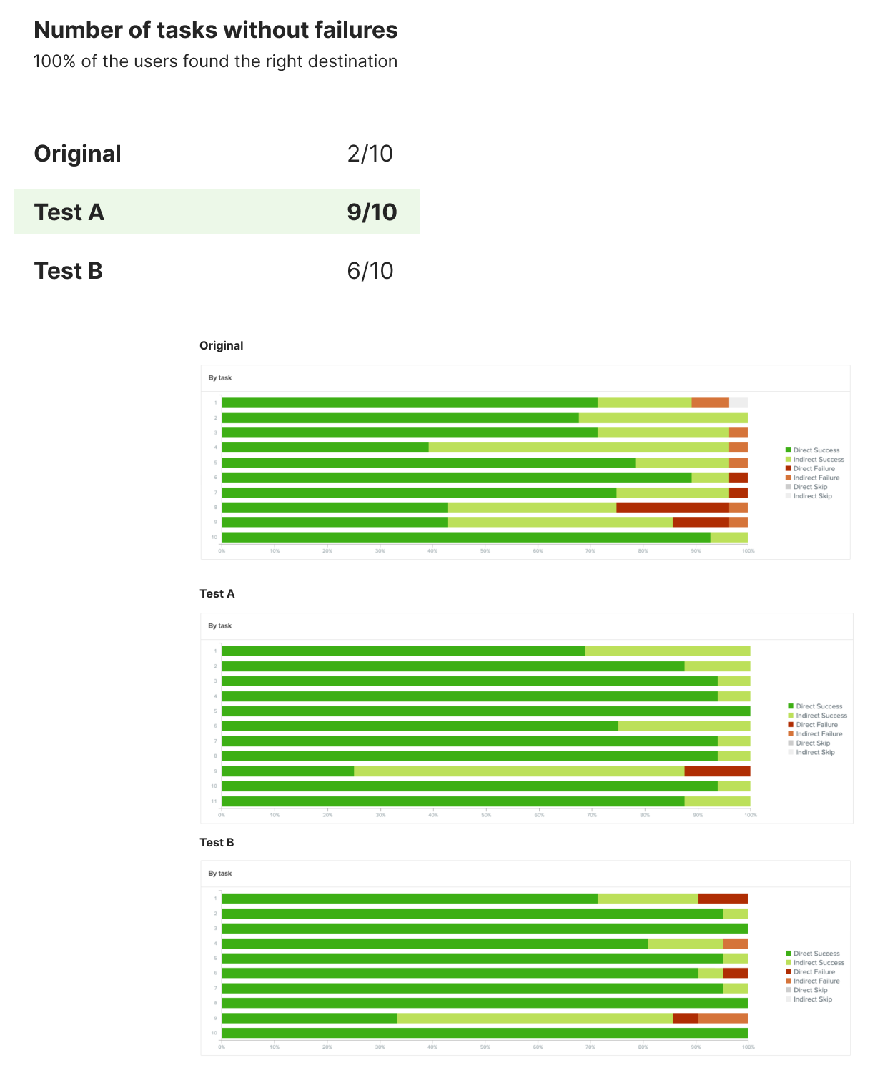
2. Having items exist in more than one place in the structure, consolidating the categories, and renaming the categories, and proved to be successful overall
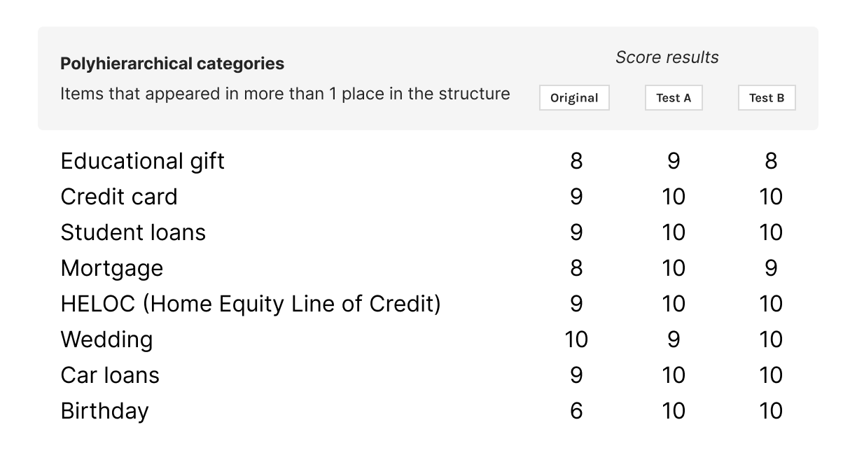
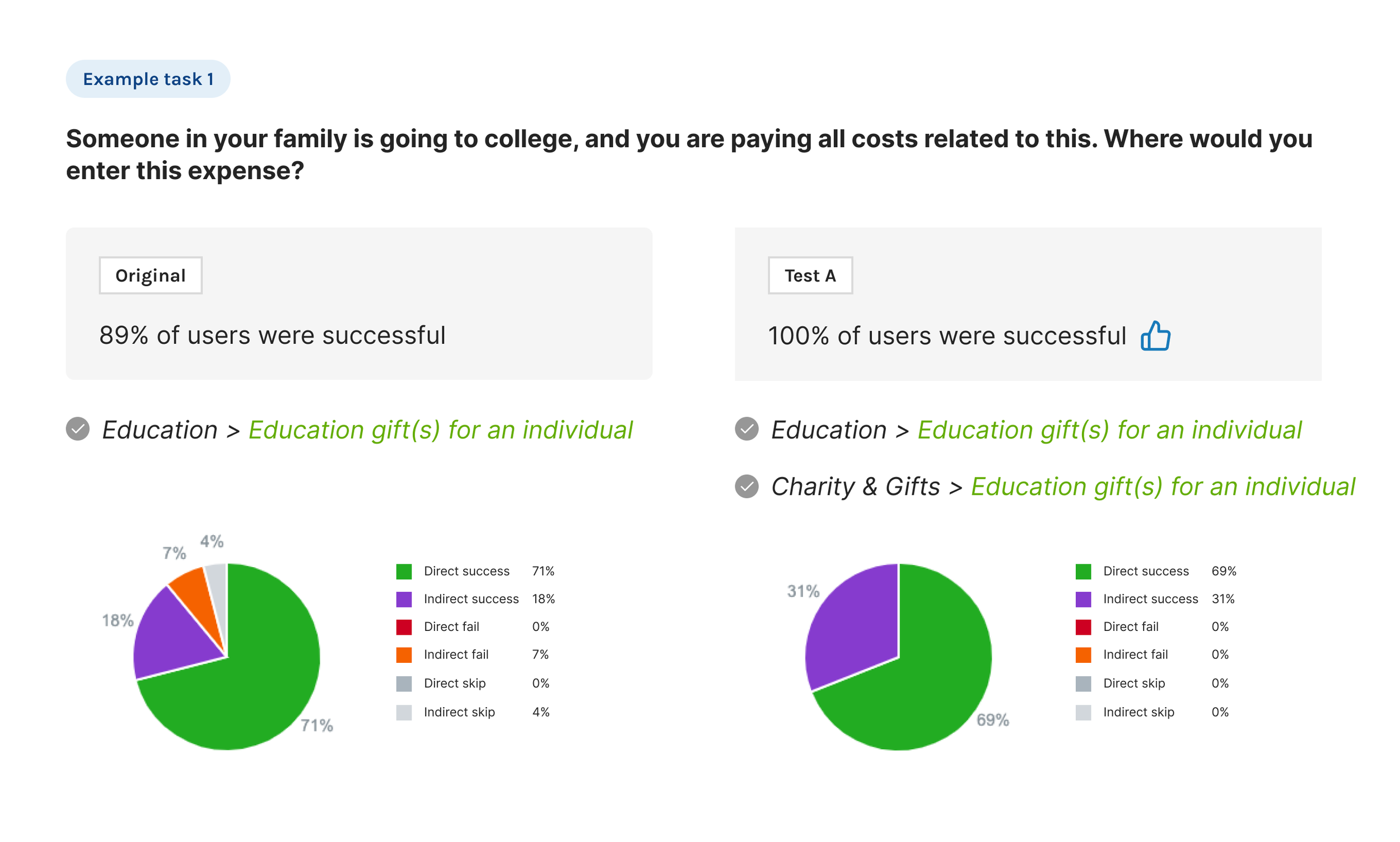
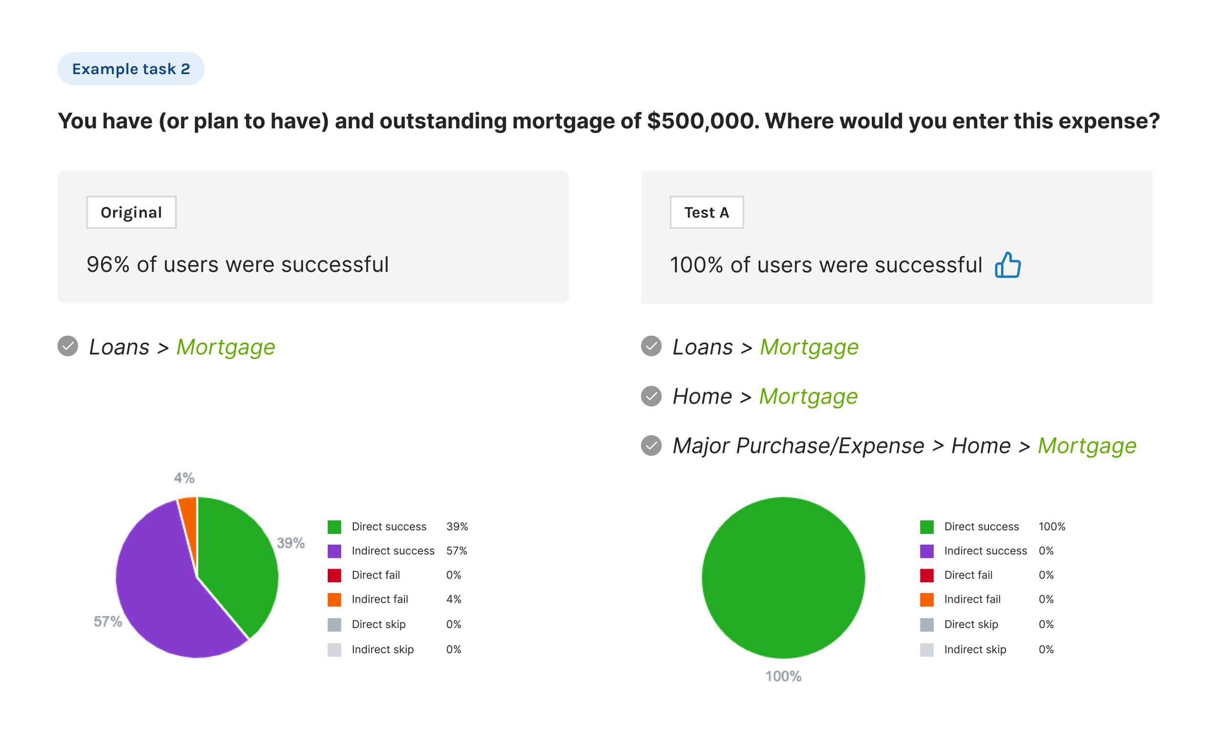
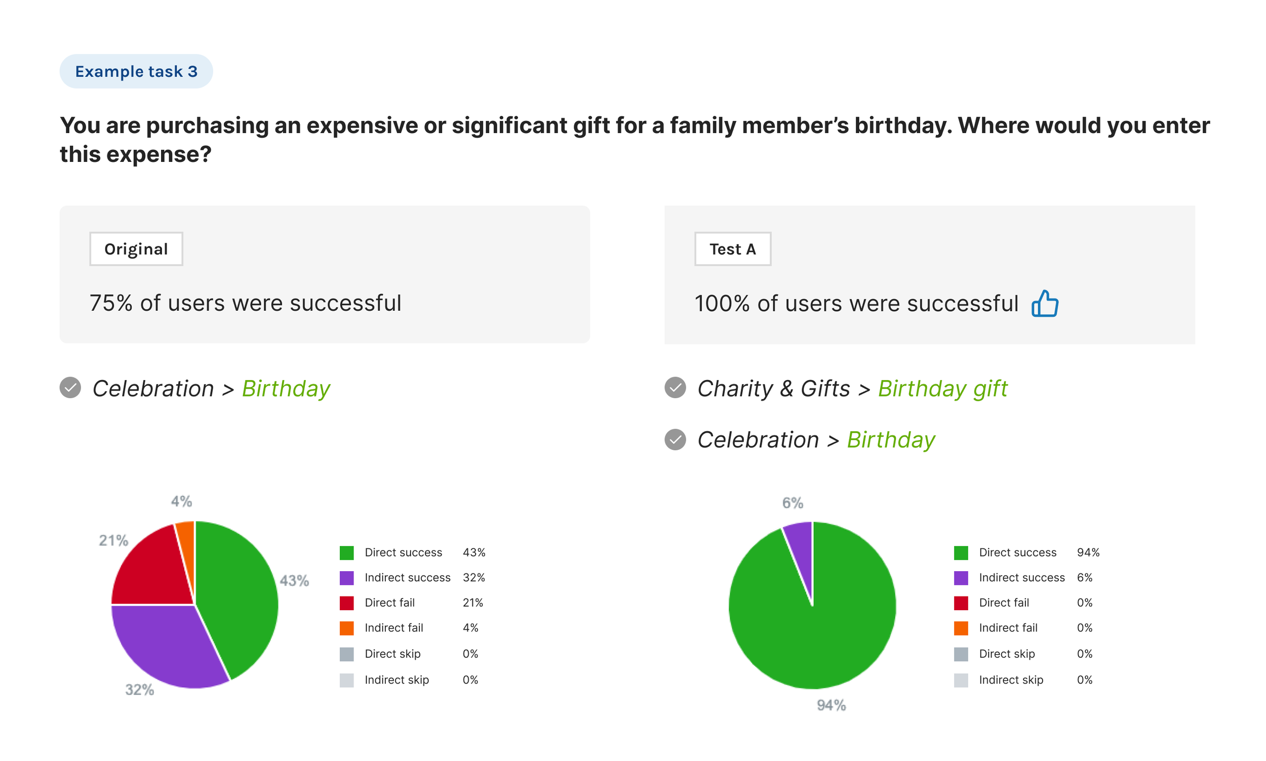
3. Between Test A and B, Test A was more successful
• Test A had more polyhierarchical items than Test B (ie. Car, Home)
• Only 1 part of the structure had more than 1 level (Major Purchases/Expenses)
• No “Other” category
“Outstanding menu structure! I have done a number of these and this was by far the easiest to find matching menu choices on!”
“Nothing was confusing. The tree is very easy to follow and the categories are logically set up with logical subcategories.”
4. Although Test A performed the best of the 3, the structure can be improved
• Some users still had trouble finding Purchase of Land
• While most users found the right destination, a few expected to find it under Home or Buying a Home
5. The Loans category might still be confusing to some
“Sometimes it was hard to know whether to look under loans or the topic of the item when asking about a loan.”
Recommendations based on tree test findings
For immediate next steps, I made the following recommendations:
• Add Purchase of Land under Home, in addition to having it under Major Purchase/Expense category.
• Based on research studies, use alphabetical order for the list
Since there were some remaining questions around improving the IA, I suggested that we run another round of tree tests in the future to identify if:
• Loans is a necessary category
• Users prefer the categories listed in alphabetical order, or in order of most commonly used categories (to confirm the other research studies found on this topic)
→ To view the full tree test study with detailed insights, click here.
Materialize: Implement
The expense category experience is available across all platforms, built in responsive web format. I documented the full userflow–from the dashboard to where the user enters all details about the expense. I also compiled the UI specs–while collaborating closely with business, tech, stakeholders, financial advisors, accessibility, and UX–detailing the back-end mapping of the categories and subcategories to the GPS tool.
Once all specs were complete, I worked closely with the dev team to implement the designs, and ensure that the final product matches the intended experience before releasing this to the public.
Final Designs

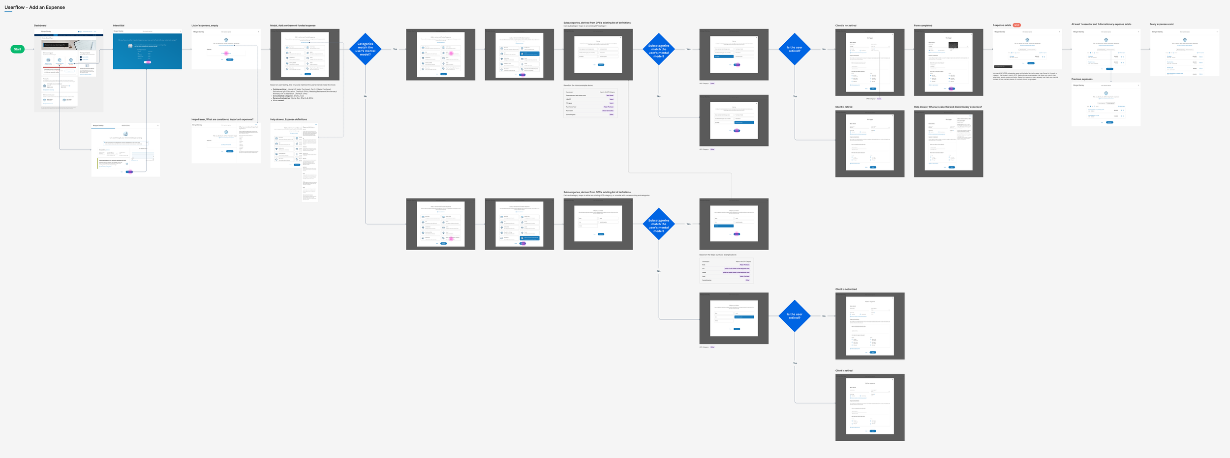
Full userflow, from dashboard to adding the expense details
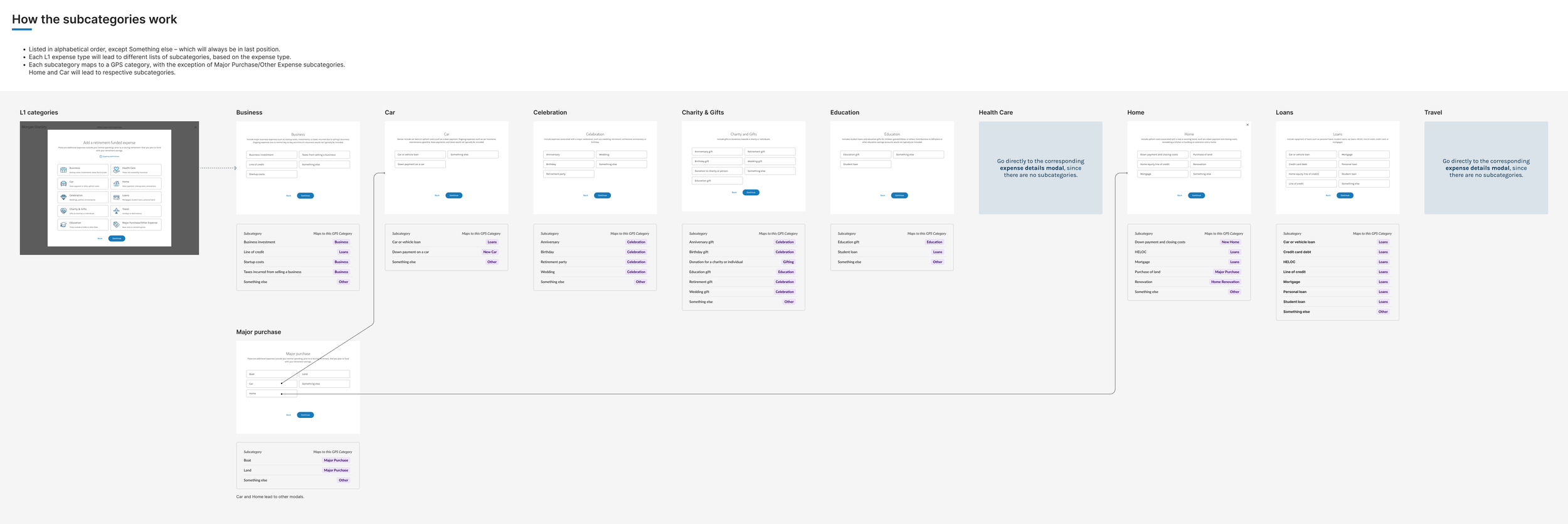
How the subcategories work
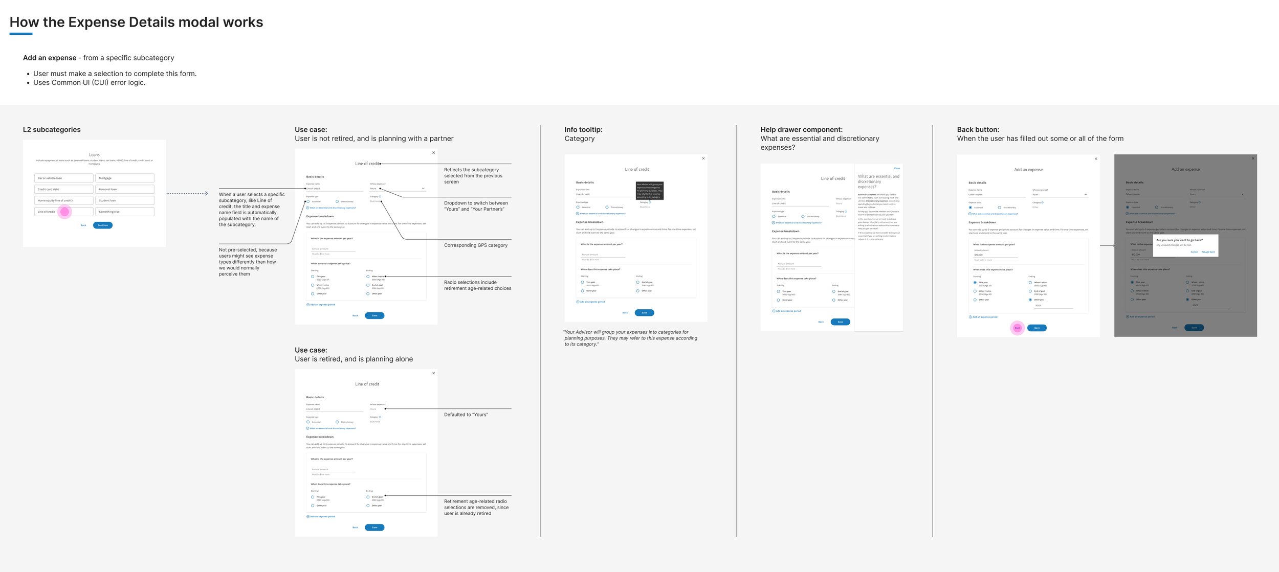
Adding an expense, from a specific category
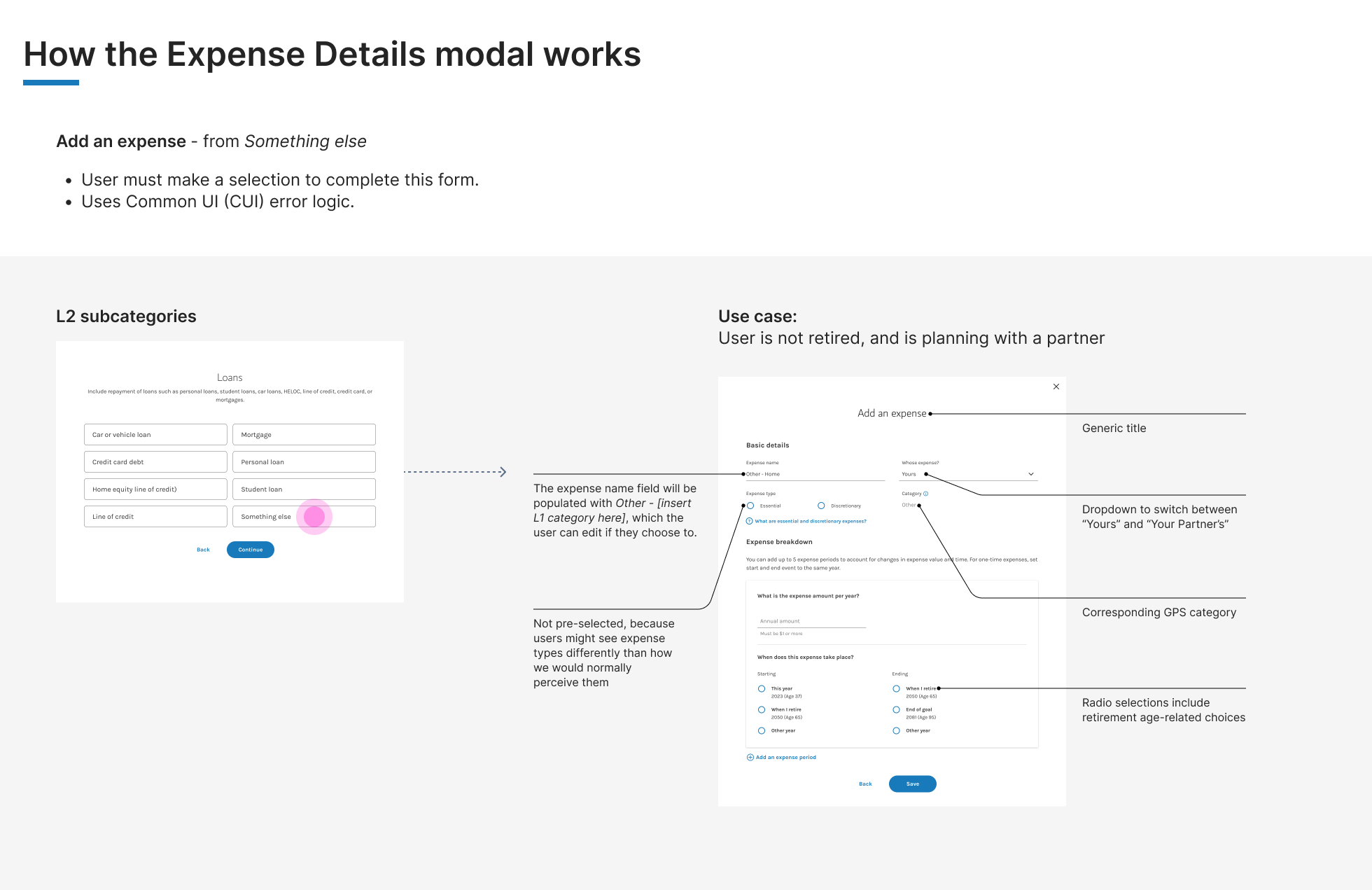
Adding an expense, from “Something else”
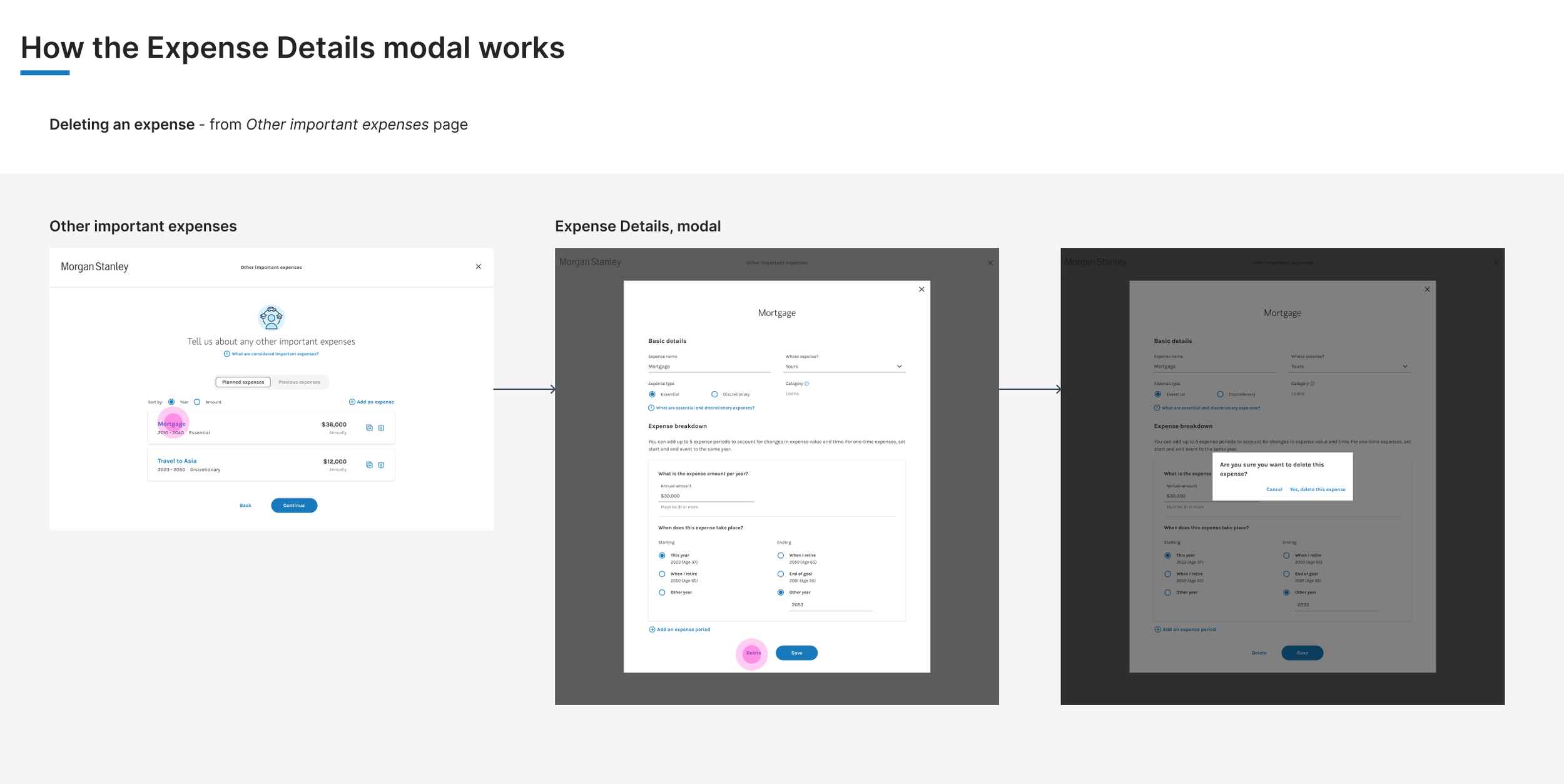
Deleting an expense
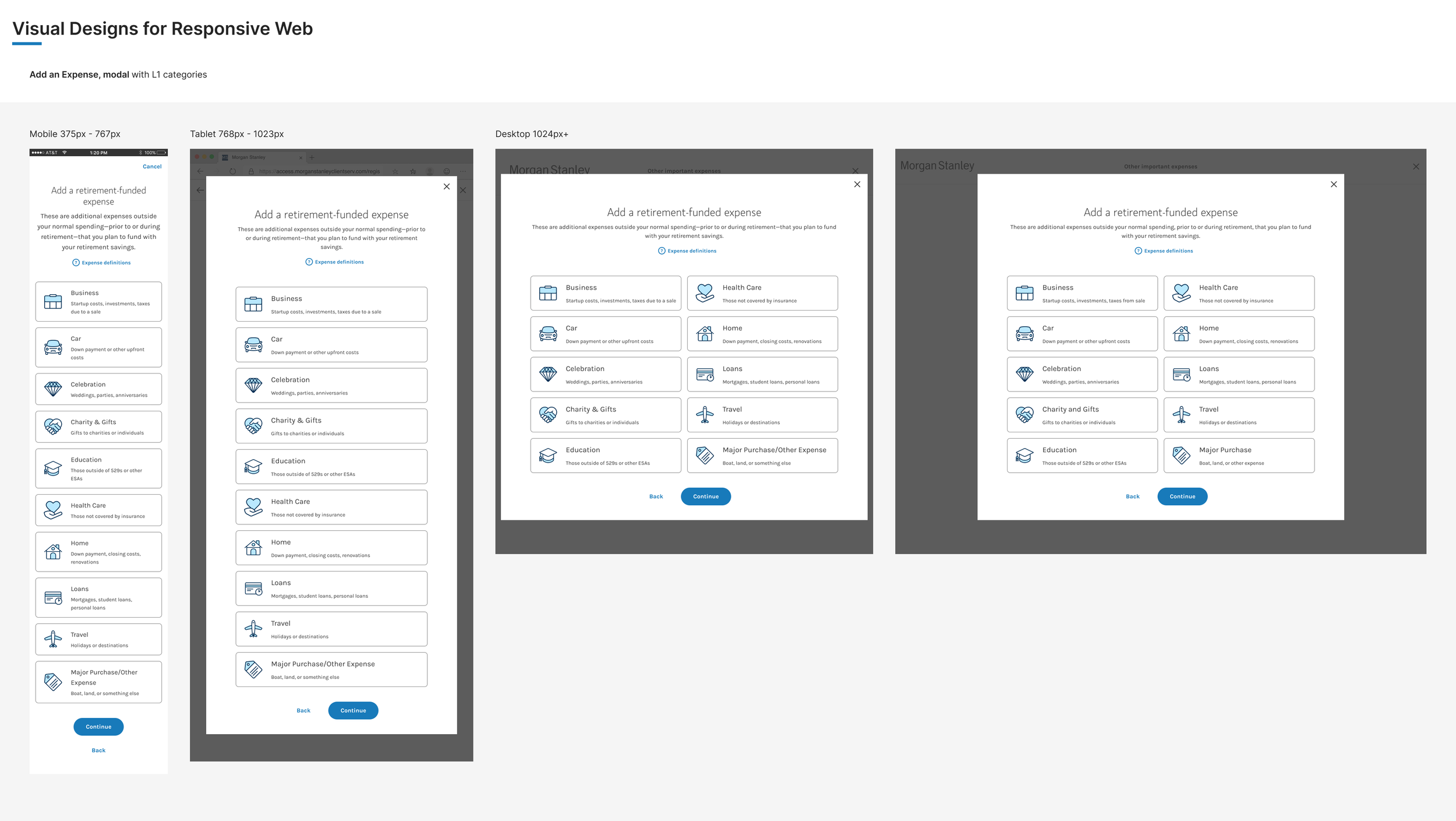
Sample specs for responsive web
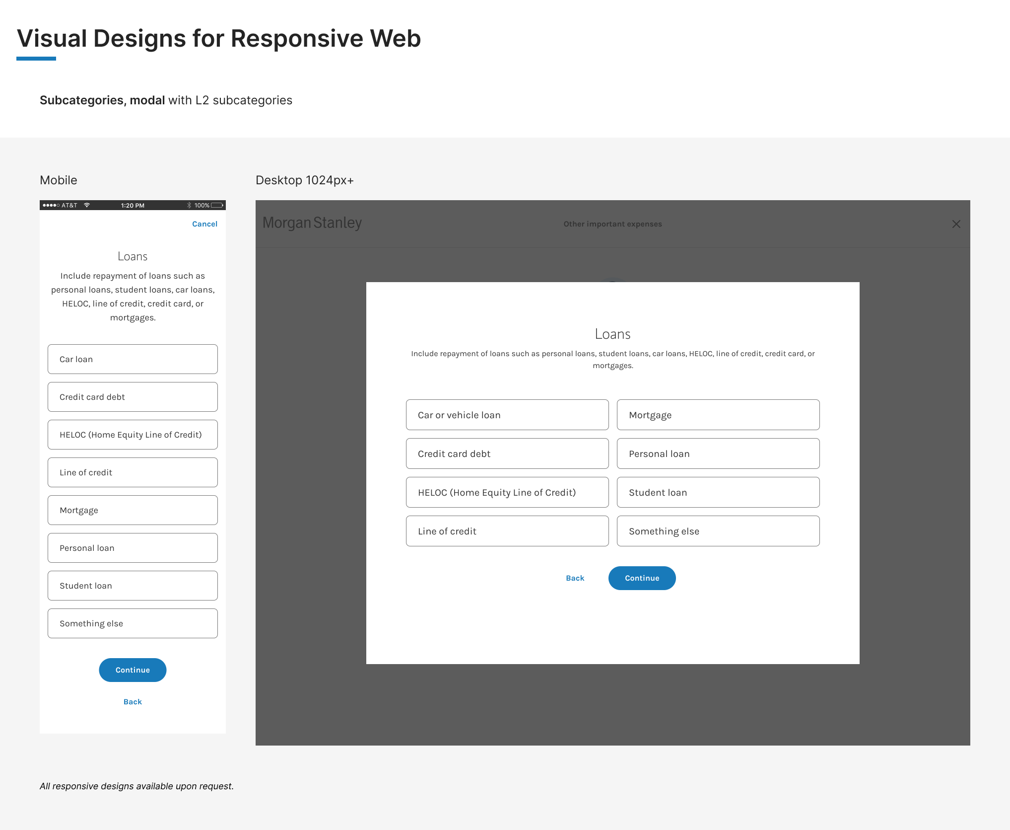
Sample specs for responsive web
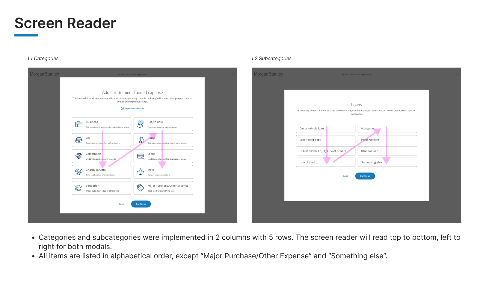
Screen reader specs
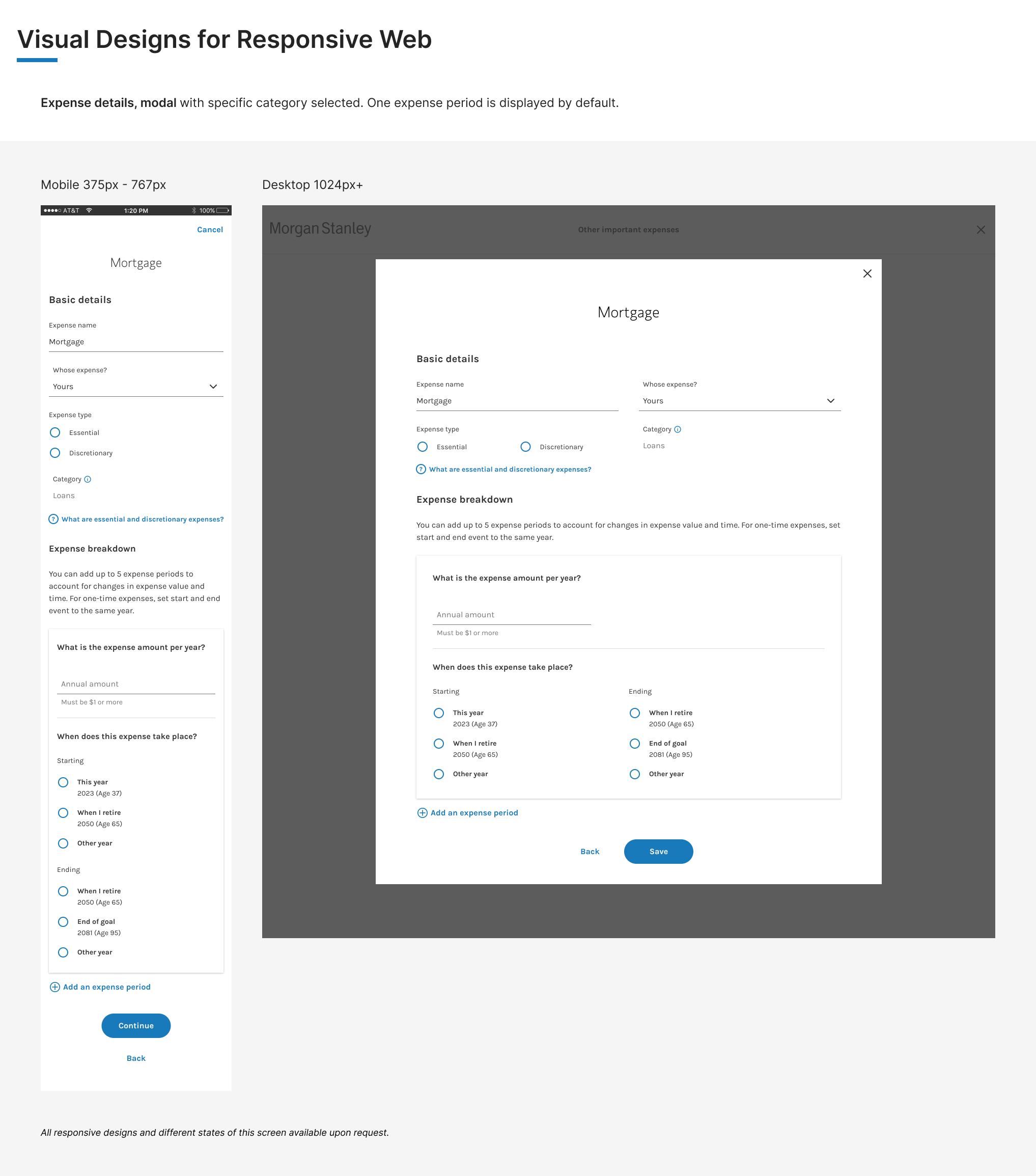
Sample specs for responsive web
What I learned from this project
1. Who knew that restructuring expense categories could be such a complex project! From uncovering how the different systems needed to communicate with each other, to understanding not just the user goals/needs, but also the financial advisor’s role in the user journey, all the tech capabilities and limitations, and paving the first path for the team to use Optimal Workshop for card sorting and tree tests–was a tremendous opportunity to drive the project from many different angles while collaborating with a significant number of team members.
2. Despite testing multiple times, there’s always room for more improvement. As mentioned at the end of the tree testing, there were a couple more open questions in regards to how to make the experience even better.
Thanks for reading, and I hope this was as interesting and enjoyable for you as it was for me!